Patient Portal
I was hired at Vecna Technologies as the lead designer on their patient portal redesign. I took input from managers, fellow designers and clients to design and prototyped the new patient portal.
Objective
Increase usability across devices while adding new features to the then-current patient portal.
Before redesign
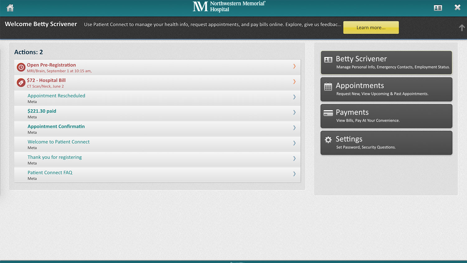
Pain points
- Top header wasted on client's logo with no real actions other than signout (which isn't obvious).
- Main navigation is placed, unexpectedly, on the right hand side, making them seem like secondary actions.
- Unnecessary introduction below header. Moving the main nav to the header should do a better job of explaining what the user can do than extra text.
- The lack of consistent alignment, dull textures and unnecessary use of wells makes the app aesthetically unpleasing.
- Unclear what "actions" are. Use of bold text and icons appears to be random, so no meaning can be derived from them.
After redesign
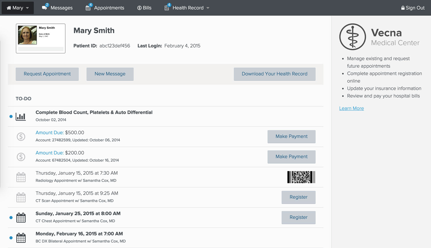
Changes
- Moved main navigation to the very top, to meet user's expectations.
- Changed "actions" to "to-do" to tell users that these are items that they need to attend to, whether it's going to an appointment, viewing test results or paying a bill.
- Added shortcut buttons to items for registering for appointments and paying bills.
- Added photo identification to differential between whose account the user is currently viewing. (Could be themself or a family member.)
- Added "messages" section for patients to communicate with their doctors.
- Added Electronic Health Record section.
- Added help aside to supply the user with contextual guidance.
- Added common actions toolbar.
- Hopefully the new design makes it more clear what users are able to do in the app without needing to explicitly point it out to them.
Tablet and mobile
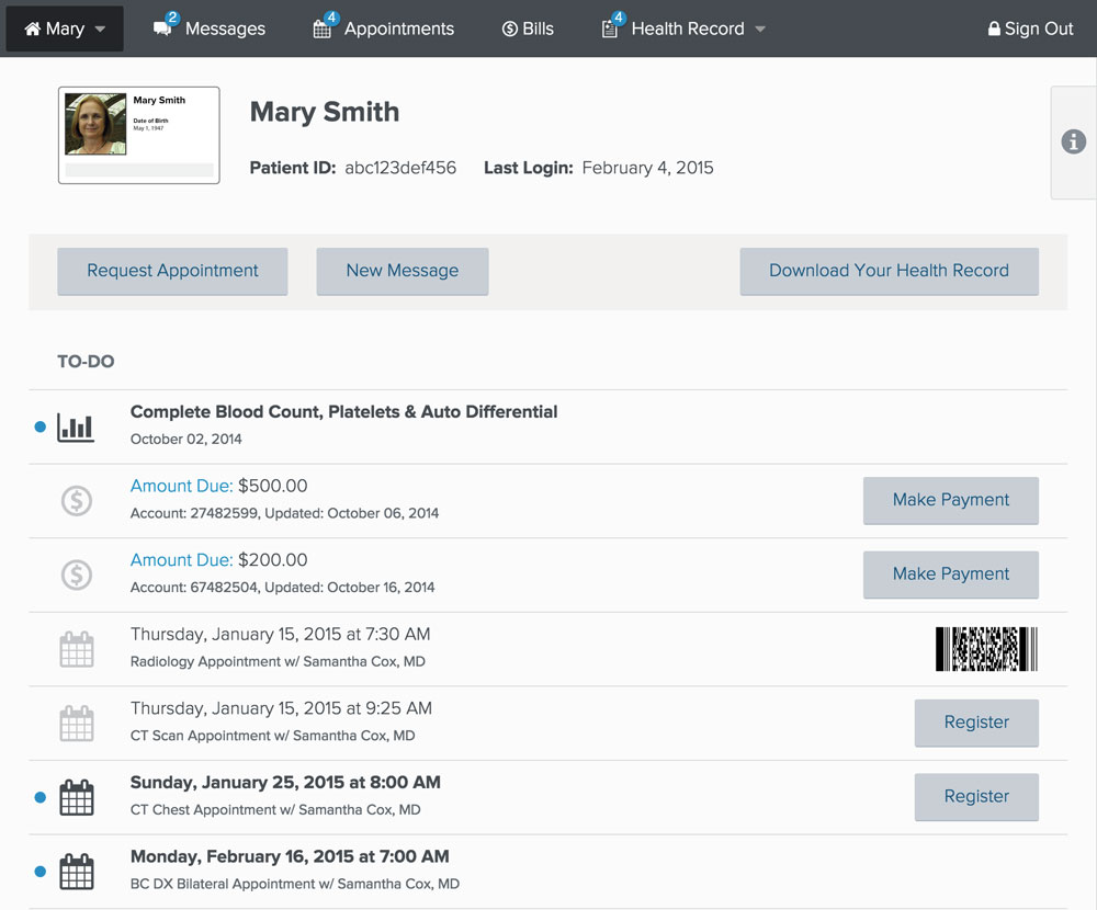
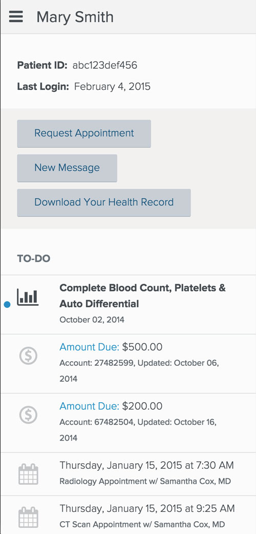
- Hid less necessary information and actions.
- Allowed the user to easily access hidden information by clicking the "i" tab on tablet or scrolling to the bottom of the page on mobile.
© Vecna Technologies